Many businesses rely on presentations to communicate with prospective buyers, employees or other strategic partners. Presentations help deliver valuable information in a clear and structured way, leaving attendees better off than before the demonstration. But in today’s competitive landscape, it’s not enough to put together a basic slide presentation or read from a script. To capture audience attention and to generate an ROI on sales and marketing efforts, businesses need to invest in presentation design quality.
This guide to presentation design covers some of the best practices for creating successful presentations, including enhancing your audio, video and lighting techniques and standards.
Why Presentation Design Is Important
Presentations use visuals and other techniques to add to a business’s message. For a big presentation to hit the mark, you need to execute the overall design properly. A great design can mean the difference between a successful presentation and one that falls flat. Investing in proper design and making presentations visually appealing and engaging helps audiences understand exactly what’s important, leading to stronger takeaways.
Below are reasons why presentation design is important for businesses and brands.
Keeps Attendees Engaged

An engaged audience is the hallmark of a successful presentation, so designing your demonstrations to involve attendees is essential. With the right design, a presentation can grab an audience’s attention and keep their focus for the entire duration. Proper presentation design can also make attendees feel that the material was directed toward them personally, leaving them inspired to act.
Presentations that keep audiences engaged are more likely to be useful and memorable, helping attendees feel they experienced something of value. Proper design presentation enhances the impact of the material and leaves audiences with an excellent impression of your business.
Makes Your Point Effectively
By strategically designing and coordinating your presentation, you can convey your ideas effectively. It’s important to deliver your material and overall message in an efficient way. Audiences want to clearly understand what the purpose of the presentation is, and they want to know they’re receiving value.
It’s also important to respect your audience’s time. A presentation shouldn’t drag out important information but rather quickly make the point and help audiences digest information along the way. Professional presenters can learn to strike a balance between being concise and not overwhelming the audience.
Creates a Strong Brand Presence
A presentation is an opportunity to represent your business’s brand in a way that makes the most positive impact. With the right representation design, you can showcase your brand in a memorable way — audiences will then associate your company with the values that matter to you.
When designing a presentation, consider how you want your brand to be perceived, such as with the following qualities:
- Professional
- Confident
- Trustworthy
- Helpful
- Inspiring
- Unique
The right presentation design can convey these top characteristics, creating a strong brand presence among your audience.
Demonstrates Expertise

When giving a presentation, it’s vital that your brand come across as an authority on the topic. A professional, well-structured and high-quality demonstration can add to your expertise as an organization.
Audiences can tell when there’s high production value involved in a presentation, and this reflects how experienced and skilled a company is at delivering its products or services. Effective presentation design leaves your audience feeling confident that your business has the expertise to solve their problems or improve their lives in some way.
29 Presentation Design Ideas
When you’re putting together a big presentation, get inspired by what’s possible. Presentations open up a world of creative opportunities to connect with your audience and share your message in a compelling and impactful way. If you’re looking for fresh ideas on how to give high-quality demonstrations, consider these top presentation ideas to enhance your design and message.
Content
When gathering design ideas for presentations, first consider the content itself. Great content design involves properly laid out written information that’s clearly readable for every audience member. In addition to being easy to read, presentation content should also follow these guidelines:
- Use a standout title page: For PowerPoint presentations, it’s important to capture audience attention immediately. Use a well-designed title page to set the tone for the presentation and get the audience anticipating what’s to come.
- Avoid wordiness: A key tip for proper content design in presentations is to avoid wordiness on slides. Large blocks of uniform text, full paragraphs and long sentences are not conducive to audience engagement.
- Ensure the message is concise: It’s not enough to just avoid putting too many words on the slides. You also need to strategically choose which words to present. Only add the most valuable content to your slides. Choose specific facts, data, statements or other strong points to add to the slides to reinforce audience learning.
- Keep enough white space: Effective slide design uses plenty of white space to make the key points stand out. White space prevents the audience from feeling overwhelmed and reduces the risk of attendees becoming too distracted or bored.
- Write for message flow: Ensure your slide content flows logically. Audiences should be able to easily follow the presentation without getting confused or feeling like they’ve missed some information.
- Tell a story: One way to make a presentation flow logically while also improving engagement is to tell a story. Structure your content in a way that there’s a beginning, middle and end, with important events or milestones along the way to keep the audience interested. You might present a problem and show how your business offers a solution, for example.
- Rely on the speaker: A presentation should be about the speaker and their ability to communicate information and share the message effectively. The slide materials are simply for support, meaning the majority of the information shouldn’t come from the slides but rather from the presenters.
- Summarize information: If your presentation covers a lot of ground in a short amount of time or is heavy on terminology or new ideas, be sure to include a final summary or several summaries throughout. Summarizing key takeaways makes the presentation more accessible to audiences and allows them to easily share what they’ve learned with others.
Equipment
Part of having a great design for your presentations is using the best equipment for the job. It’s important to plan ahead and make a list of the types of equipment and tools you’ll need for a successful presentation. Consider the following presentation equipment tips:
- Use presentation design software: Presentation creators have a plethora of visual design software to help them build the most professional-looking presentations possible. You can also use design software, like Visme, Prezi or Canva, for PowerPoint design ideas by browsing their templates for inspiration.
- Test equipment beforehand: When practicing your presentation, make sure to test all your equipment to ensure it’s functioning. This includes your laptop, power plug, mouse, clicker or other equipment.
- Ensure a strong internet connection: If livestreaming or other internet-based materials are part of your design presentation, be sure to test the Wi-Fi strength ahead of time. Alternatively, you can hardwire your computer to the internet to guarantee a stable connection.
- Familiarize yourself with the venue: Before your presentation, familiarize yourself with the venue. Orient yourself in the space and identify any potential distractions or features of the venue that might either draw away from or enhance the presentation design quality.
- Have a backup plan: Be sure to have a backup laptop, mouse, clicker or any other tools in case of equipment failure. Be ready to convert your presentation to a different format if necessary to preserve the design integrity of your message.
Visual
Presentations need high-quality and consistent visual design elements to keep audiences engaged. When deciding on the visual structure of a presentation, there are a few design ideas that can reinforce the message. Try the following presentation ideas and tips to enhance your demonstration:
- Choose one cohesive style: Cohesive visuals are important for presentation design quality. Ensure all the icons and slide designs are consistent in colors and fonts and that they match your brand.
- Add graphs, charts and visuals: To convey information in a clear and concise way, use visual design elements, such as graphs, charts or infographics. Add images, photos and other graphics to enhance impact.
- Use high-quality images and videos: If you plan to add photos or videos throughout your presentation, make sure they’re high-resolution files. Purchase professional photos or have a graphic designer review your presentation to ensure the images enhance the overall design.
- Use transitions and animations strategically: Animations and transitions can enhance the visual design of your presentation. Be sure to use them sparingly and to use cohesive elements that follow the same style throughout the presentation.
- Account for presenter appearance: Don’t overlook the presenter’s appearance when it comes to the visual quality of a presentation. The presentation medium itself, such as videos, PowerPoints or demonstrations, should support the presenter, not detract from them. The entire presentation, including the presenter and the materials, should flow cohesively in style and aesthetic.
- Consider using props: When used effectively, props can be a great visual aid to help drive home important points or demonstrate key information. Props shouldn’t be distracting but should add value to the presentation, including by helping the presenter feel more comfortable in front of an audience.
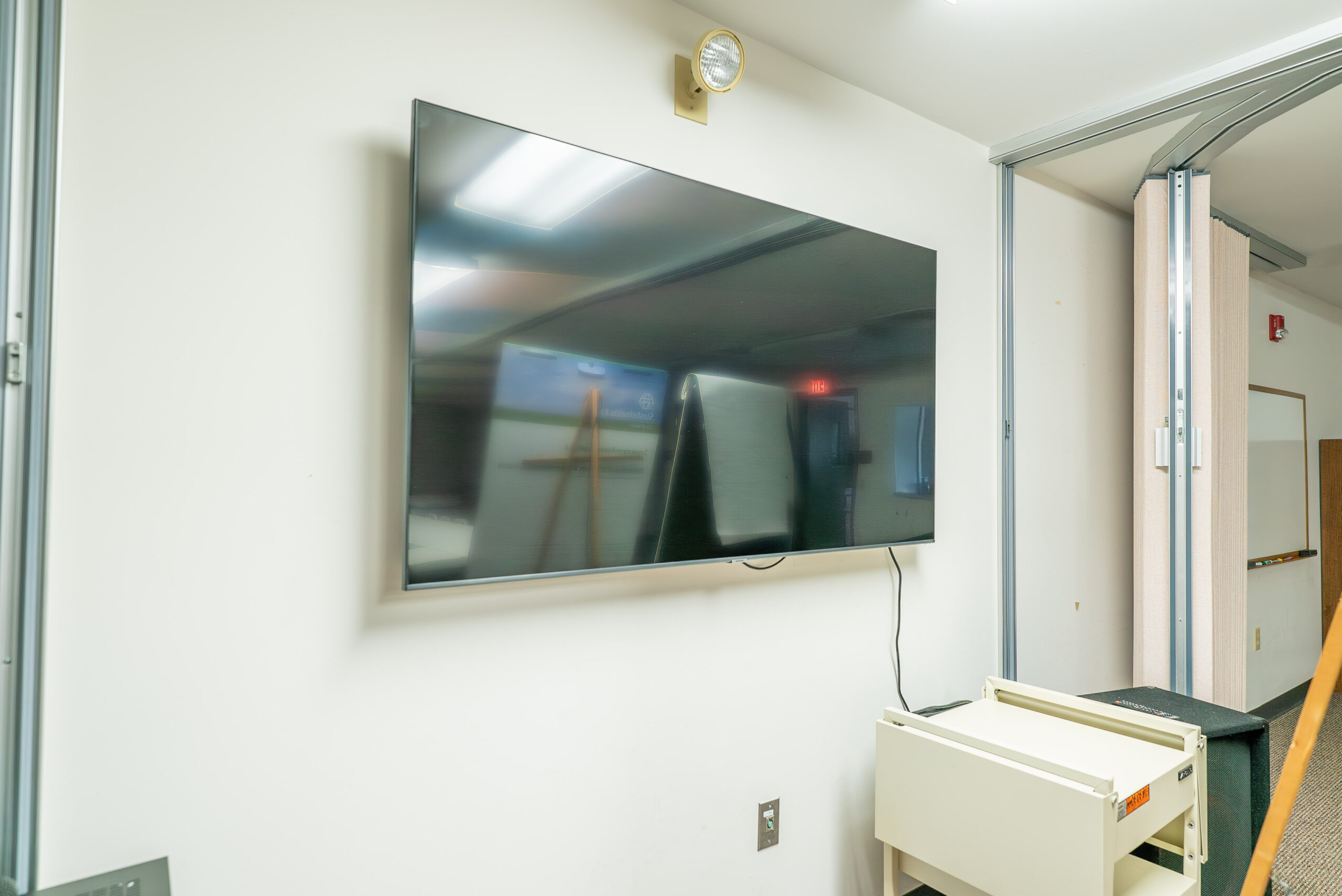
Deliver the highest quality visual experience possible with custom video installation services from Illuminated Integration. Work with us to develop a high-end visual design experience for your big presentations, whether you need a projector setup, livestreaming or recording services or other video capabilities.
Audio
The audio quality of a presentation is critical. Presenters need to be able to clearly share their message whether it’s through speaking or through any music or audio clips used in the presentation. Below are some audio tips to help enhance a presentation’s design quality:

- Use high-quality microphones: Invest in a quality microphone to guarantee the audio quality of your presentation. Consider whether a hardwired mic or something wireless would be more convenient for your setup and the presenter.
- Check input volume levels: If you’re using audio software or recording your presentation, make sure your input volume level is high enough. Also, make sure it’s not too high to prevent it from sounding distorted.
- Limit background noise: When giving a live or recorded demonstration, it’s always important to control background noise. Ambient noise like buzzing fans, machinery, traffic noise and other disruptions can negatively impact the presentation experience. Set up sound-dampening solutions or find other ways to protect acoustics as much as possible before beginning your presentation.
- Play music strategically: Music can be a great design element to add to your presentation. Be sure to use music strategically, such as only during the introduction and conclusion. Make sure the style and tempo of the music match the overall tone of your presentation.
- Do a sound check: Be sure to test all your audio equipment and sound quality before giving the presentation. With your team, do a test run of the presentation to ensure the audio quality is consistent throughout.
Hiring professional audio designers from Illuminated Integration can ensure your presentations always deliver the highest audio quality possible. Our team can help you design a comprehensive audio system that enhances your presentation design.
Lighting
For big presentations, such as conferences, speaking events, seminars or other major presentations, invest in lighting to help enhance the message and improve the audience’s experience. Lighting can also help the presenters, allowing them to feel more confident in their appearance and skills in front of an audience. Below are a few tips on proper lighting design for big presentations:
- Avoid natural light: For live presentations, you want to avoid natural light or compensate with artificial light. Natural light is unpredictable and can change suddenly, impacting your presentation quality and distracting your audience.
- Use layered lighting: For the best possible lighting quality, use multiple different sources of light that integrate into a clear and cohesive source of illumination. By layering at least two sources of lighting, you can choose how to increase or decrease focus on certain areas, depending on the type of stage.
- Create dimension with fill lights: Fill lights are additional lights that help illuminate areas not directly lit by the main source of light. Adding fill lights creates a more even cast while also adding more dimension to the setting and enhancing the presenter’s overall appearance. You can add or remove fill lights to adjust the overall mood of the presentation.
- Add backlighting: Make the presenter and the visuals stand out against the backdrop by using backlighting. A backlight creates a contrast between the presenter and the background by adding a shadow around them. This effectively pushes the presenter forward, drawing full focus to them.
- Prevent glare: Glare can be a serious distraction during presentations. Whether it’s a subtle glare off an area of the stage or an obvious glare coming from the presenter’s glasses, it’s important to minimize light reflections as much as possible.
Take your presentation design quality to the next level by working with professional lighting designers. Illuminated Integration lighting design services help you create a high-quality presentation experience for audiences.
Take Steps to Improve Your Presentations

Well-designed presentations are essential when delivering an impactful message. They can boost audience engagement, brand authority, professionalism and overall presentation clarity. Whether you’re on stage during a conference or in a boardroom during a meeting, there are many different presentation design ideas that can apply to your situation.
Discover how Illuminated Integration can help you make your presentation design as engaging as possible. Contact us today for more information on our AVL services.
